Brand Guidelines
Get the official branding standards for Oxnard, CA. Download logos, explore typography, and access color palettes.

Logo Usage
The Visit Oxnard logo is personal to the city’s diverse attractions and laid-back, approachable culture. It uses friendly, fluid letters and a strong horizontal line to emulate the sun sinking into the ocean.
Click to download all versions and colors of the logo:
Just looking for one file type? Click for a shortcut to:

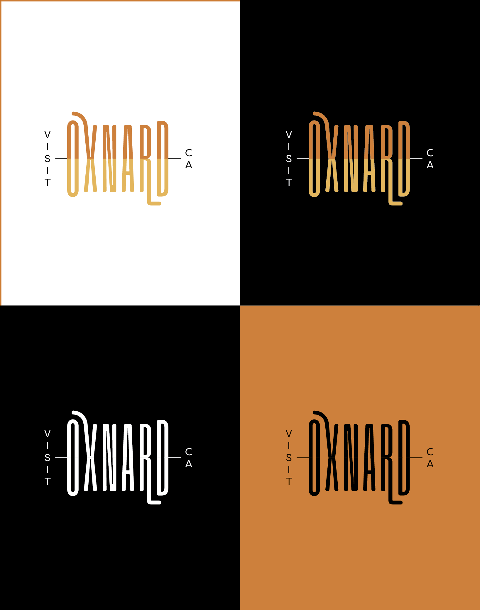
Full Color
The Visit Oxnard logo has five full color versions. When in doubt, the yellow-orange logo should be used as the primary logo, however, there is flexibility depending on design and application as to when to use which logo. Being able to use all five interchangeably speaks to the versatile nature and diversity in experiences and culture found in Oxnard. The full color logo versions should be used as often as possible to build a strong brand identity.
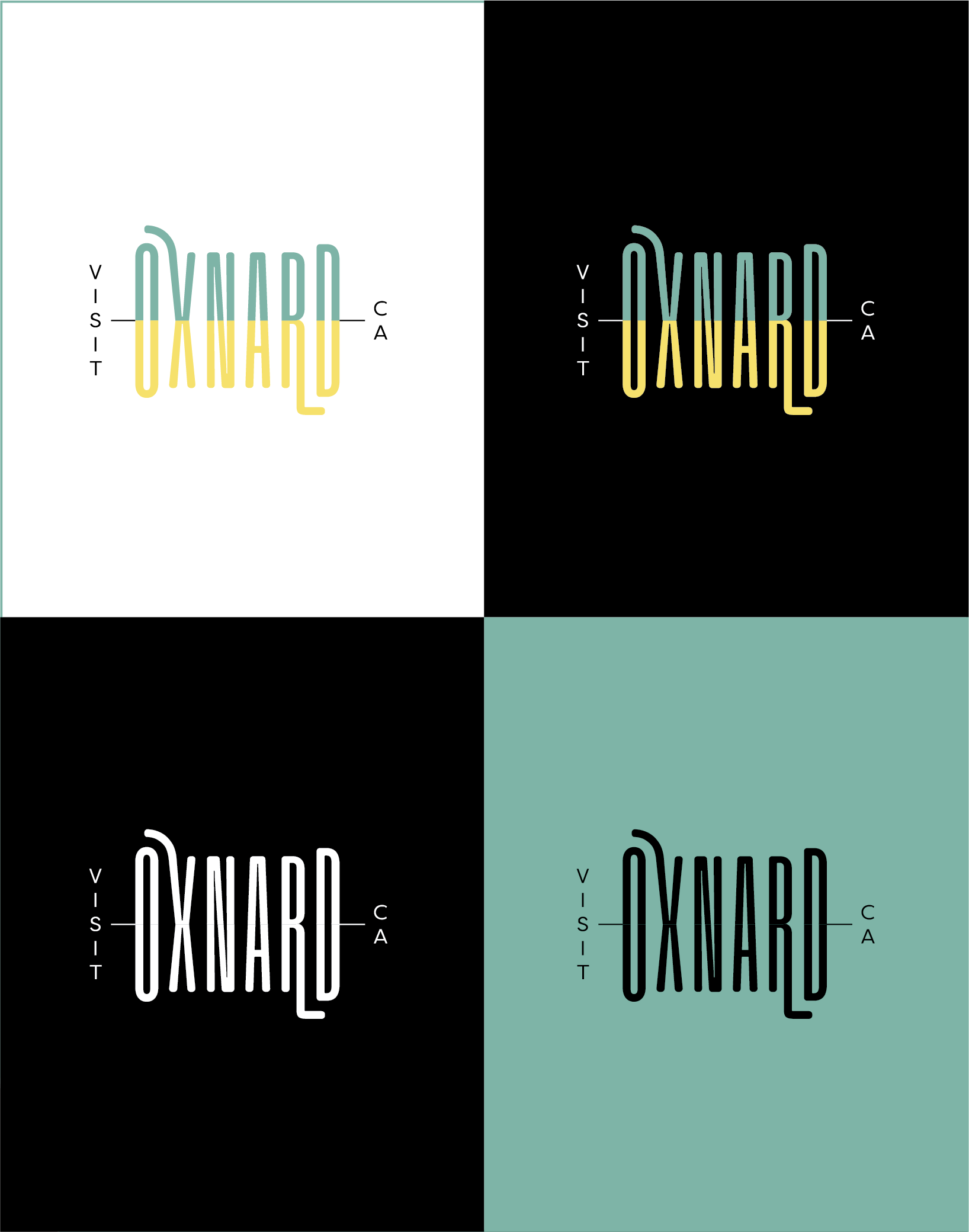
Alternative Color Options
Full Color Reversed
Use these versions when the logo is overlaid on a photo or background that can support the colors of “Oxnard”, but loses the colors, and therefore the visibility, of “VISIT” and “CA.” Please use discretion when doing this and default to the white reversed option when necessary.
White Reversed
If ever the logo is to be overlayed on a photo or background and the full color reversed option is unusable, the white version should be used.
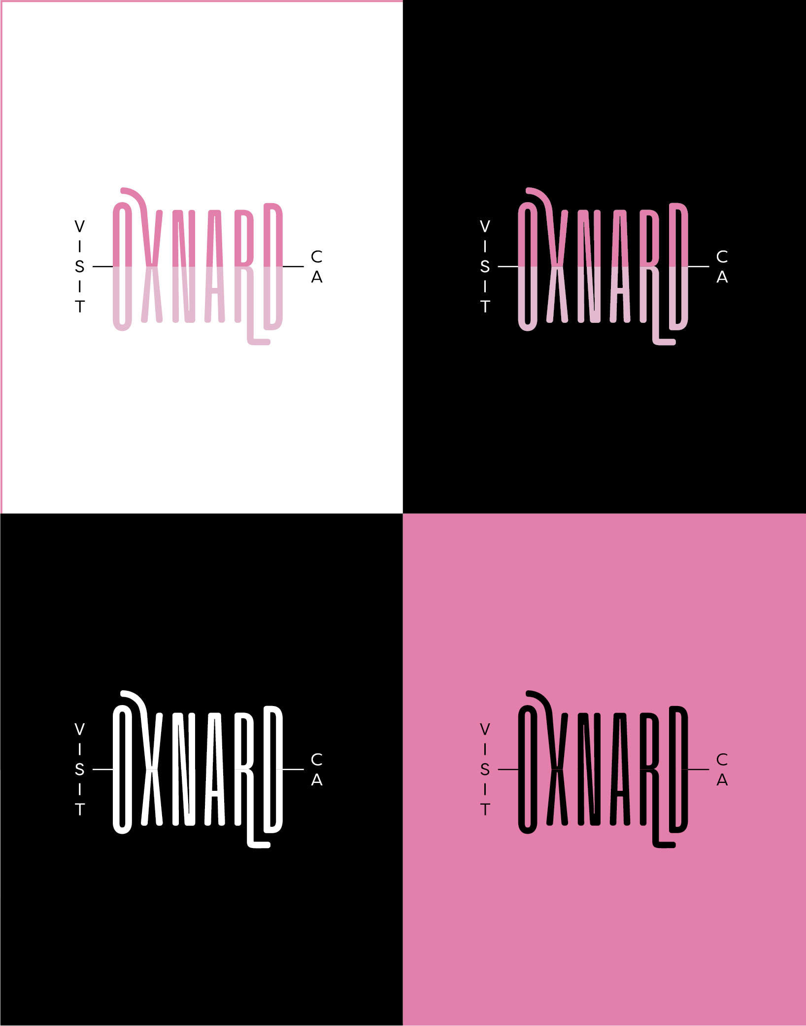
Black
Use this only if no other color version of the logo is an option, for example, screen printing.
Grayscale
Use this logo when printing in black and white, for example, in a newspaper publication.
 |  |  |
Size & Spacing
Minimum Size
The logo should always be clearly legible and should never have a height smaller than 0.45”.
Clear Space
When placing the logo within artwork, please maintain a padding of clear space around the logo. The padding should be the length of the connecting lines that extend from the logo to “VISIT” and “CA”, and should be maintained all the way around the logo. That is to say that no image, or other text should extend into this padding area.

Typography
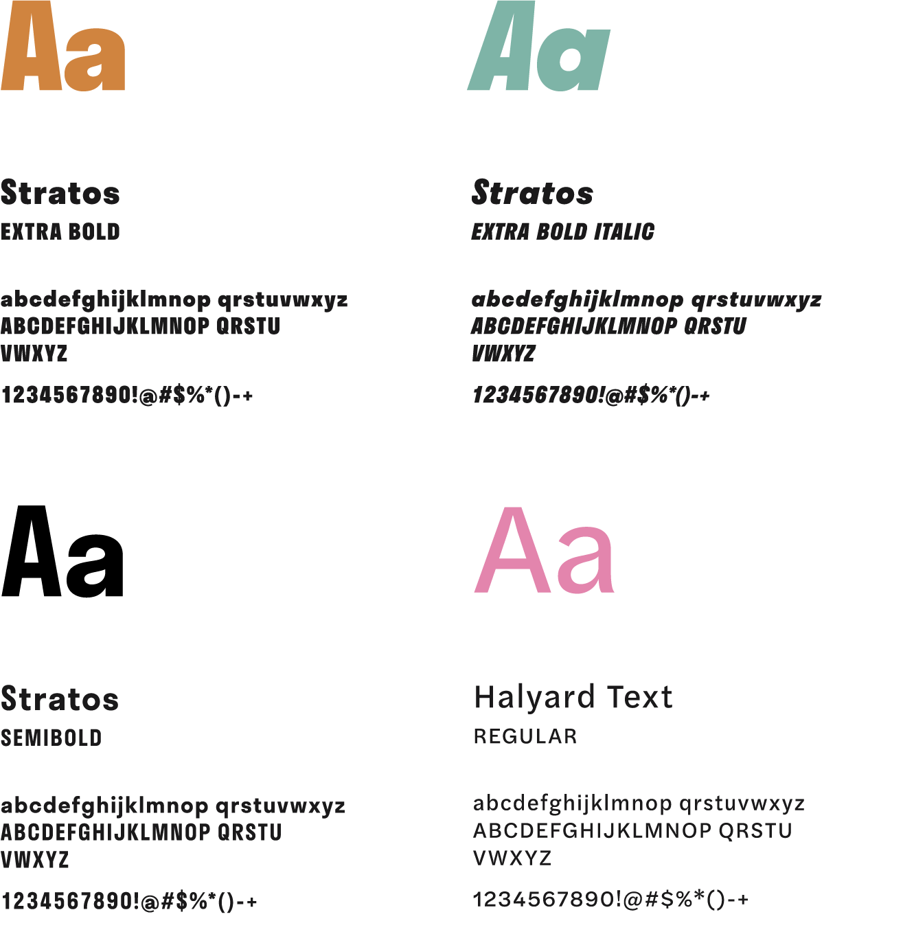
The brand typography must speak to the Oxnard personality and culture. Strong and legible, yet still approachable and laid back, Agenda is the brand’s primary typeface. Agenda has a wide variety of font styles, allowing for contrast between bold and thin, wide and condensed, regular and italic. When Agenda is not available for use in the digital space, Helvetica should be used.
As with the Visit Oxnard logo, consistent use of the brand typefaces reinforce the overall brand identity and personality.
 |  |
Agenda
This typeface should be used as the primary typeface for all printed and digital content. In this way, Agenda’s simplicity works to its advantage, as it is very versatile and can be used for a diverse set of applications, while still jiving well with each personality of Oxnard.
Regular should be used for body copy, Regular all caps for headers and condensed italic for subheads.
Helvetica
For digital correspondence and internal communication Helvetica may be used if Agenda is not available. It is available on most computers and can be consistent from computer to computer. This should NOT be used in printed collateral or external marketing materials.
All styles are acceptable (use Regular, sentence case for body copy).
Color Palette
The Oxnard color palette is fresh, warm and energizing. The shades of orange are vibrant and full of life, and point back to the city’s sunny and welcoming nature. While still lively, the shades of blue also bring in a cool and rejuvenating contrast.
Here are the color breakdowns for each production format. CMYK colors are used for any basic printed materials (flyers, brochures, documents, menus etc). RGB colors are used for any digital materials (social media, e-newsletters, website, TV advertisements, etc). The web safe colors are similar to RGB and are only used for digital materials. The six-digit code is an easy way to add specific colors when changing web design preferences.

Be the first to get insider news and event updates!
Get the latest on everything Oxnard